
Immersive presentations with data: towards a more human approach with numbers
In a world of increasing quantity of data, proper communication of results and information becomes an essential skill for businesses and institutions. However, more and more, the gap between the data presented and its understanding increases.
Get the main takeaways from the post HERE.
According to Scott Berinato (2018), senior editor at the Harvard Business Review, the challenge starts with data teams and analysts. In the vast majority of cases, they are not used to communicate data to non-technical audiences. At the same time, the understanding of data is challenging for non-technical audiences, such as stakeholders, clients, and executives.
“Data teams know they´re sitting on valuable insights but can´t sell them. They say decision makers misunderstand or oversimplify their analysis and expect them to do magic, provide the right answers to all their questions. Executives, meanwhile, complain about how much money they invest in data science operations that don´t provide the guidance they hoped for. They don´t see tangible results because the results aren´t communicated in their language.”
There are several solutions for this challenge, which mostly is about communication. In this article, we propose the use of immersive presentations as a novel way to communicate fact-based information in compelling and engaging manners addressed to non-data specialists. Our aim is to address the gap in communication between data teams and executives.
We propose the use of immersive technologies (AR in the case presented here) to present data in a narrative manner to non-data specialists. Data can be visually represented via data visualisation. According to a group of researchers at Caltech university: “Visualisations create a bridge between the quantitative nature of data and human intuition” (Donalek et al., 2014). In addition, research has shown that data visualisation is a useful support for communication and enables to share a common vision among several people to foster joint understanding (Ware, 2013).
With immersive technologies, the visualisation presented has a tendency to become experiential, a term used by Alberto Cairo to refer to visualisations that have an emotional factor that may lead to action (2019).
A more “human” way of presenting information
What do we mean by human? Less hermetic, much more experiential and accessible to a wide range of audiences that are non-data experts. The use of natural gestures enables a more “human” approach in the interaction with data. Interacting with our hands is much more natural than using intermediary objects to act upon computer-generated information.
In addition, research has shown that presenting information with immersive technologies enhances engagement in data-informed decisions. For example, when engaging a local community in a meeting including stakeholders and policymakers to visualise the impact of climate change in the commune through an immersive presentation (Marriott et al., 2018).
Immersive presentations: opportunities and risks
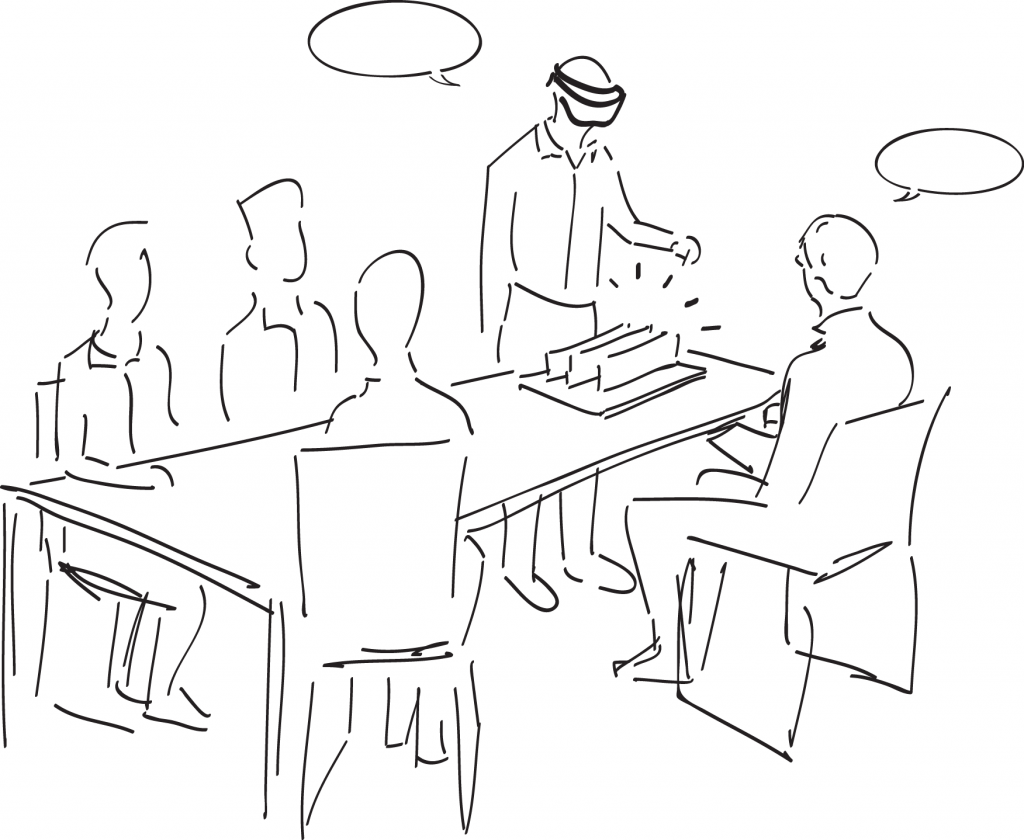
The case we present in this article is part of my research at Engineering Systems Design Group, The Technical University of Denmark, and has been conducted with a HoloLens data visualisation developed together with Virsabi, a company in Copenhagen specialised in delivering virtual and augmented reality solutions to businesses.
We conducted a workshop with professionals from the finance sector (two data analysts, one manager and one executive) where we assessed qualitatively the experience of visualising data in HoloLens. Each participant experienced, in turns, the visualisation. We interviewed each of the participants and held a collective review to understand the opportunities and risks of using immersive presentations.
The opportunities that emerged during the interview are the following:
- Presence and engagement. One of the participants commented that presenting data with an immersive presentation implied presence and engagement with the content presented. Scientific literature backs up that the level of engagement increases with immersive technologies (Sylaiou et al., 2010).
- Accessibility of information to non-data experts. Immersive presentations would make easier to understand the information presented to their clients, who are not data-experts.
- Directed focus of attention. Immersive presentations allow to present one number at the time, alongside the narrative of the presentation, therefore directing the focus of attention to the right numbers.
- Simultaneous perception of the environment, the participants, and the data. A factor to consider with regards to attention in the presentation. Immersive presentations “fade into the background” (Weiser, 1991).
The risks observed and mentioned during the presentation are the following:
- Invasive hardware. Using a headset to present information during a presentation is something that should not be taken lightly, as it may alienate the relationships between the participants in the presentation. Moreover, in formal meetings, it can add a touch of “fun” that diminishes the formal setting of the meeting.
- Requires additional time for the use of the technology. Basically for two reasons: (1) to show the user how to wear the headset, (2) to give some light training to familiarise the user with the technology.
- Distractions from the content presented. Presentations with immersive technologies are eye-appealing and imply that the user sometimes focuses too much on the technology Vs. focusing on the content.
- Extra cost of the hardware and software. This aspect should be weighted case by case, to assess whether it makes sense and profit to use immersive presentations for your organization.
The results from our workshop showcase opportunities with regards to a higher level of engagement, presence, and a directed focus of attention in presentations. However, using immersive presentations today is still novel and the use of immersive technologies in presentations can lead to a shift of attention from the content presented towards the technology used to present the content. I am sure that, as immersive technologies become more and more widespread in the years to come, this issue that we have in 2020 will gradually fade.
Therefore, immersive presentations should not be considered as a substitute to traditional presentations on a screen or with documents. However, we can start envisioning scenarios where more traditional presentations are “boosted” with immersive content, strategically placed in the presentation to delight your clients and state that you are at the forefront of your industry.
This post is based on the paper “Immersive Visualisations in Design: Using Augmented Reality (AR) for Information Presentation” (Bravo & Maier, 2020).
REFERENCES
Berinato, S. (2018), “Data science and the art of persuasion”, Lettera Matematica, Vol. 6 No. 2, pp. 121–129, https://doi.org/10.1007/s40329-018-0225-5.
Bravo, A., & Maier, A. (Accepted/In press). Immersive Visualisations in Design: Using Augmented Reality (AR) for Information Presentation. In Proceedings of the Design Society [183]
Cairo, A. (2019), “The functional art: an introduction to information graphics and visualization”, The Functional Art, Musings on the Modes of Visualization Design, https://doi.org/10.5860/choice.50-3652.
Donalek, C., Djorgovski, S.G., Cioc, A., Wang, A., Zhang, J., Lawler, E., Yeh, S., et al. (2014), “Immersive and collaborative data visualization using virtual reality platforms”, 2014 IEEE International Conference on Big Data (Big Data), IEEE, pp. 609–614, https://doi.org/10.1109/BigData.2014.7004282.
Marriott, K., Schreiber, F., Dwyer, T., Klein, K., Riche, N.H., Itoh, T., Stuerzlinger, W., et al. (2018),Immersive Analytics, Vol. 11190, Springer International Publishing, https://doi.org/10.1007/978-3-030-01388-2.
Sylaiou, S., Mania, K., Karoulis, A. and White, M. (2010), “Exploring the relationship between presence and enjoyment in a virtual museum”, International Journal of Human Computer Studies, Vol. 68 No. 5, pp. 243–253, https://doi.org/10.1016/j.ijhcs.2009.11.002.
Ware, C. (2013), “Chapter 1 – Foundations for an Applied Science of Data Visualization”,Information Visualization, pp. 1–30, https://doi.org/10.1016/B978-0-12-381464-7.00001-6.
Weiser, M. (1991), “The Computer for the 21st Century”, Scientific American, Vol. 265 No. 3, pp. 94–104, https://doi.org/10.1017/CBO9781107415324.004.